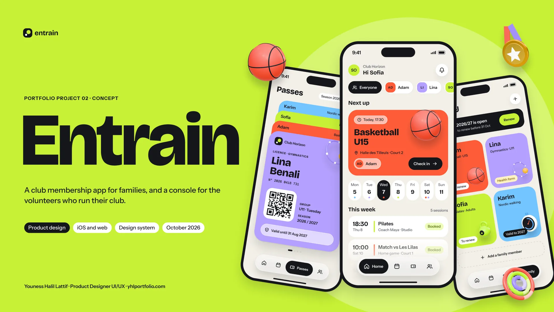
My membership in 5 minutes
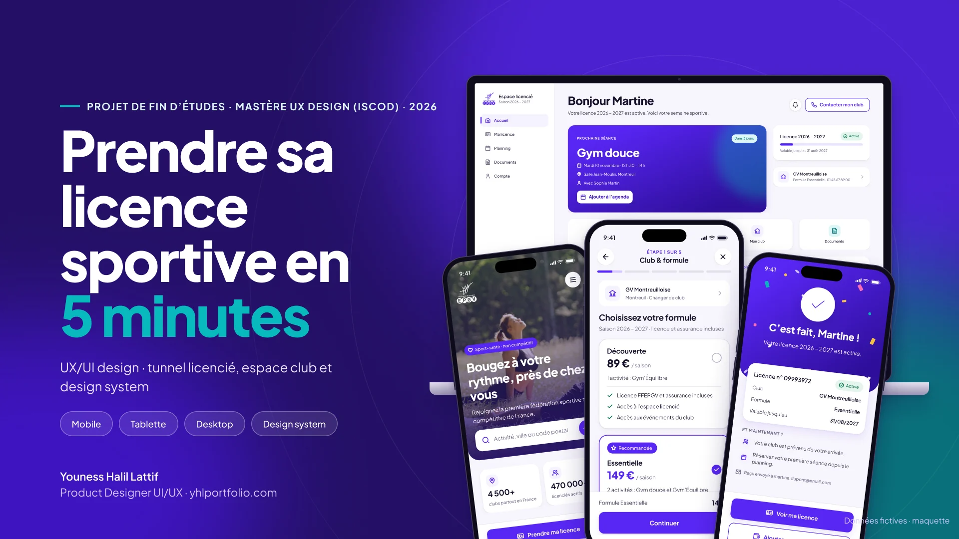
Getting a sports membership in 5 minutes: UX/UI design of a membership sign-up journey for a health and fitness sports federation: a 5-step member flow, a club space for volunteers and an accessible design system, on mobile, tablet and desktop.
01 Context
Every season, thousands of people take out their membership through an affiliated club. The process relies on long forms and manual data entry by clubs that are often run by volunteers.
Goal: a self-service, fast and accessible sign-up that gives clubs their time back.
02 The problem
For members: long procedures and poorly explained health documents. For clubs: manual reminders and incomplete files.
03 My approach
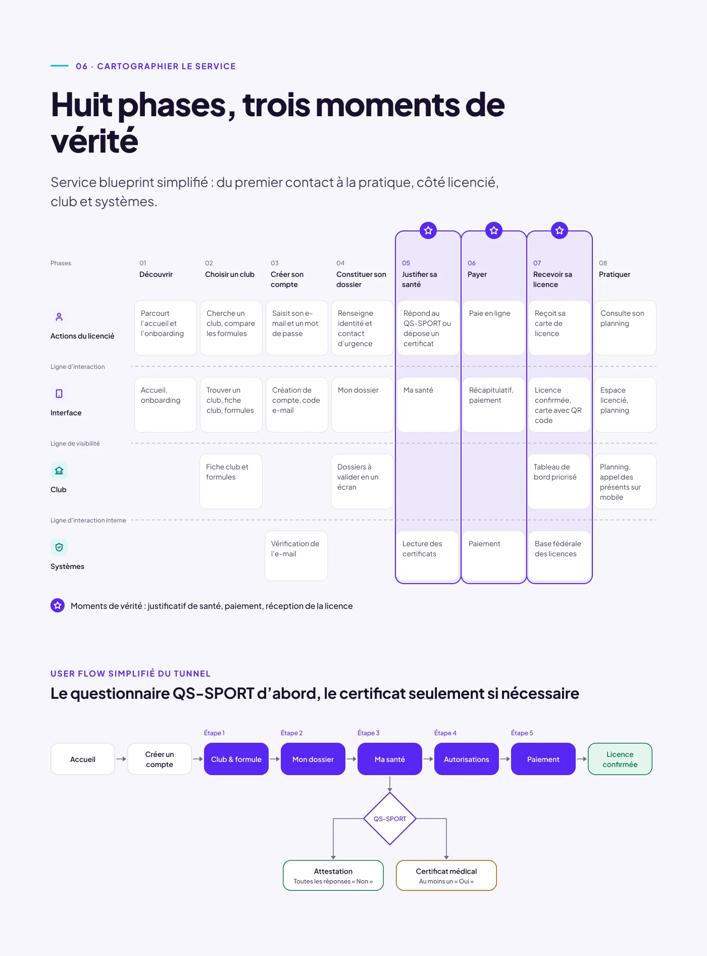
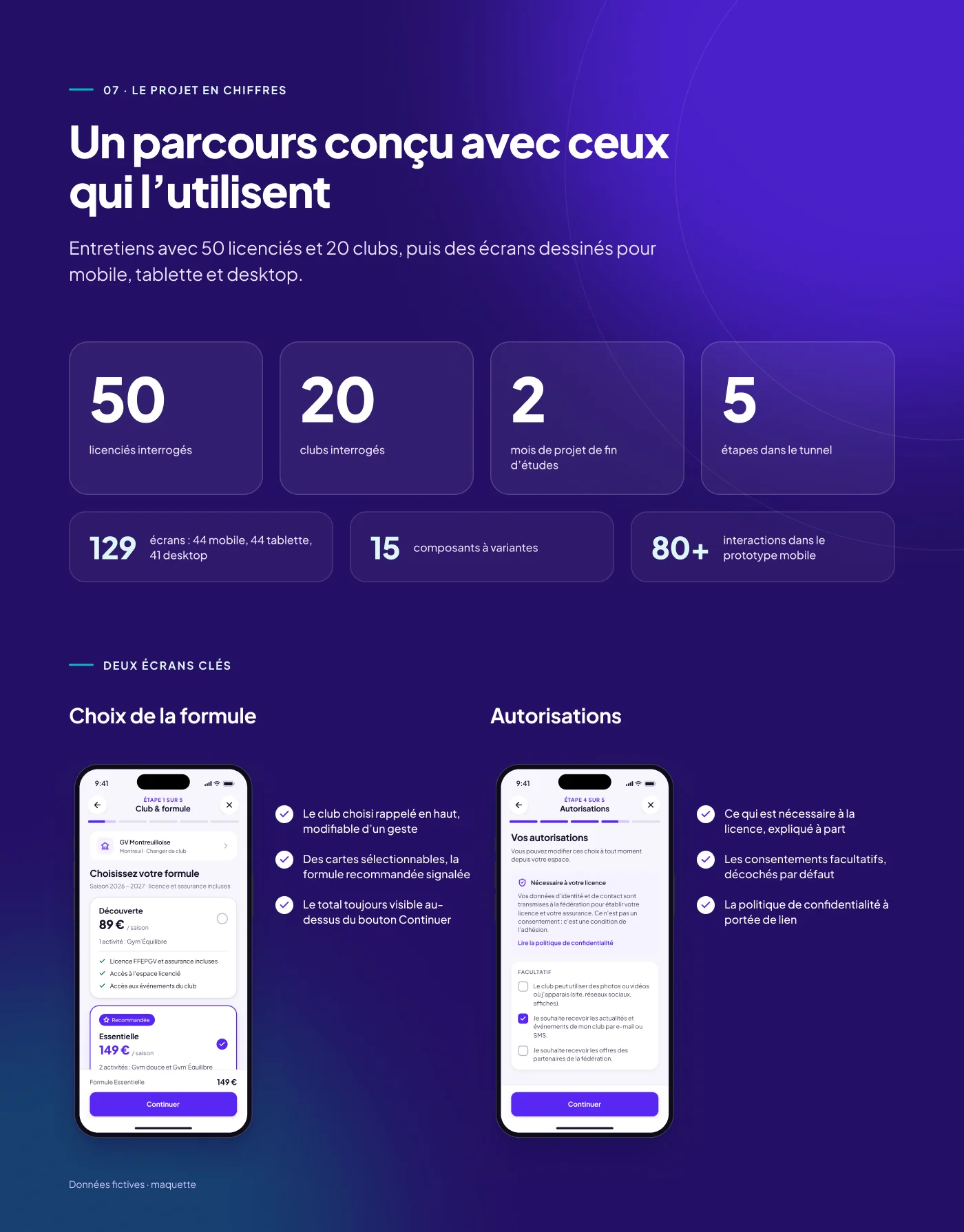
A double diamond over 2 months: discovery, framing, ideation, prototyping, testing. Interviews with a panel of 50 members and 20 clubs, personas, service blueprint and user flow before the first screen.
Guiding principle: digital by default, human when needed.
04 Research
Interviews with the people who live the sign-up process, on the member side and the club side.
05 Five design choices
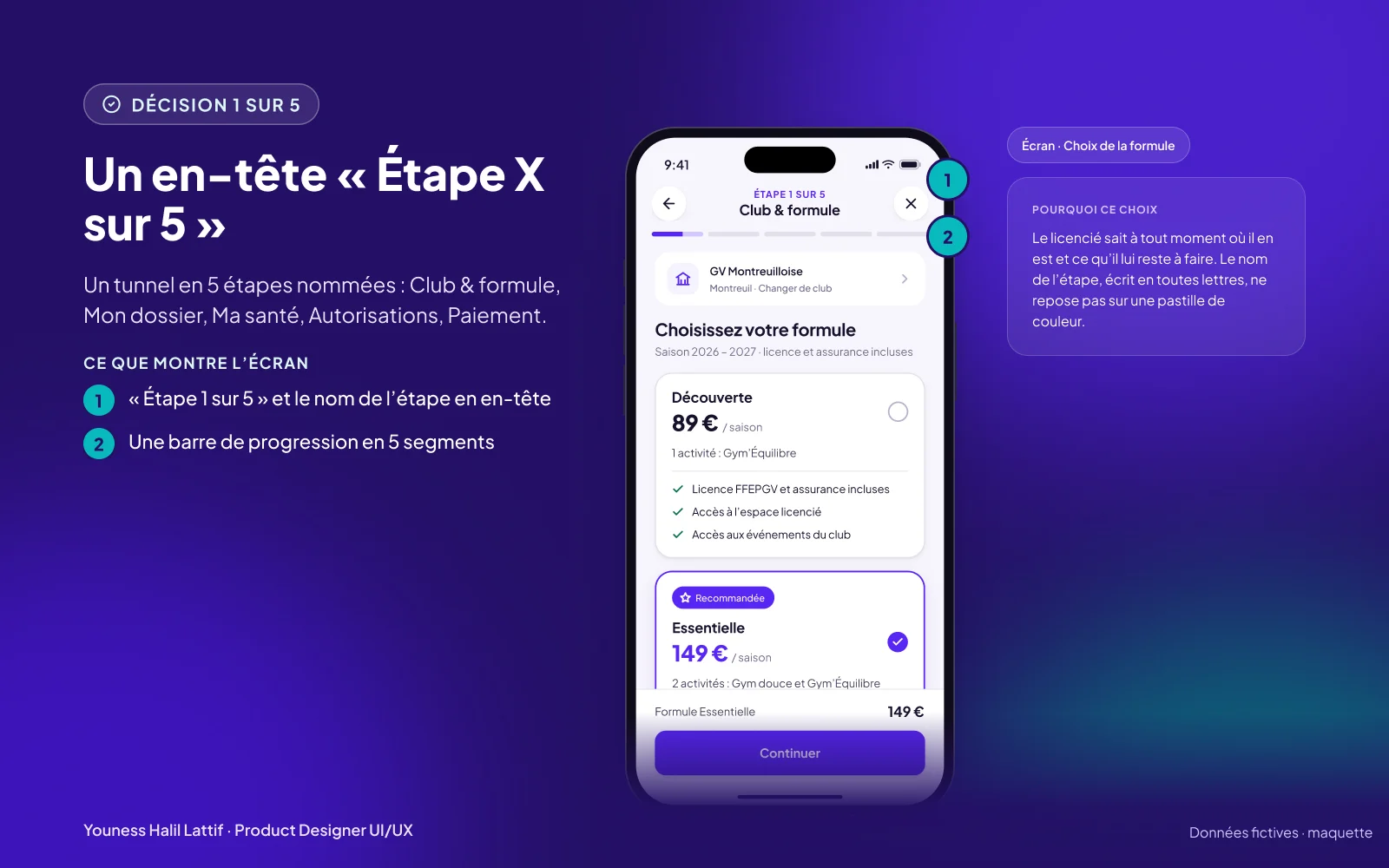
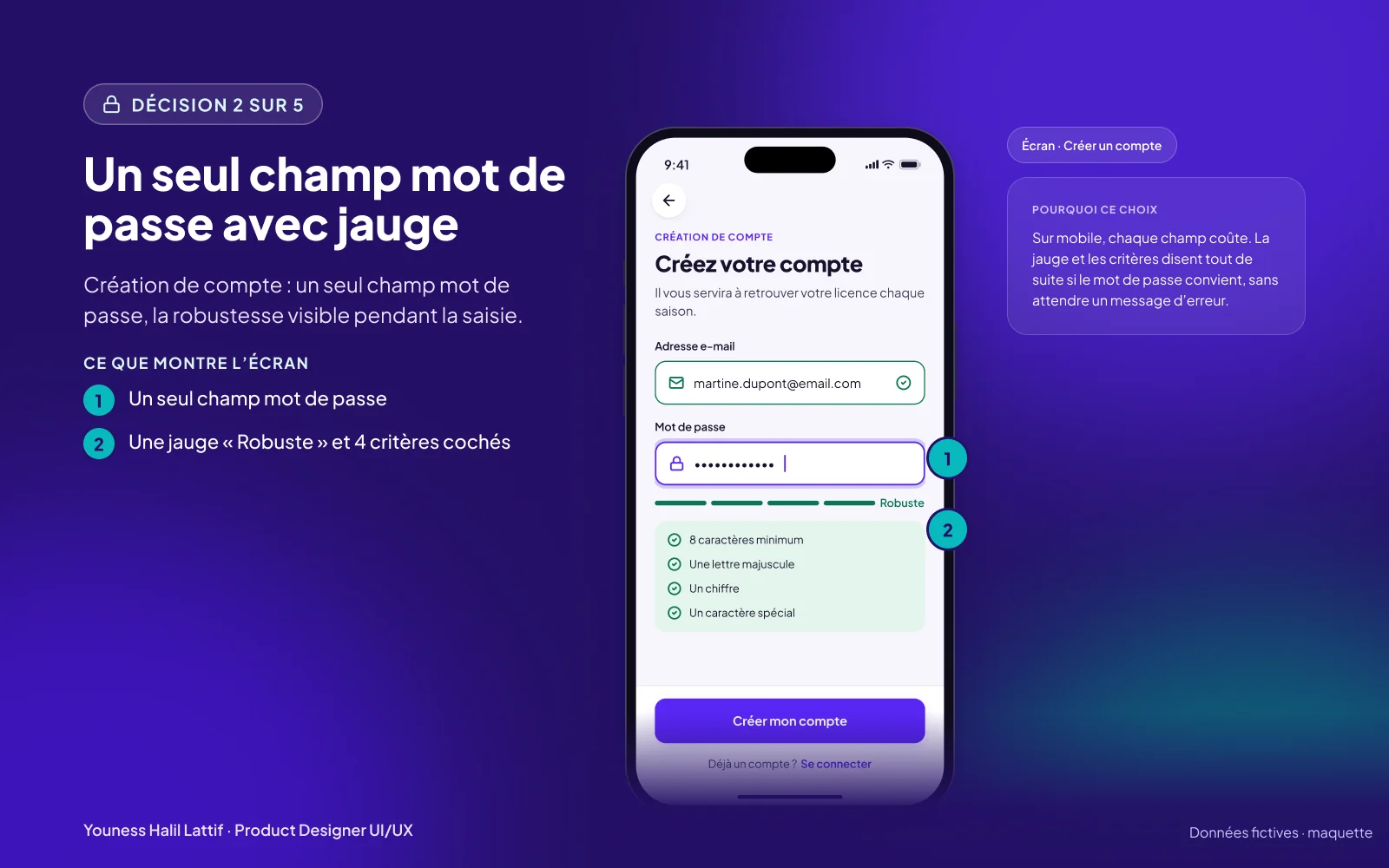
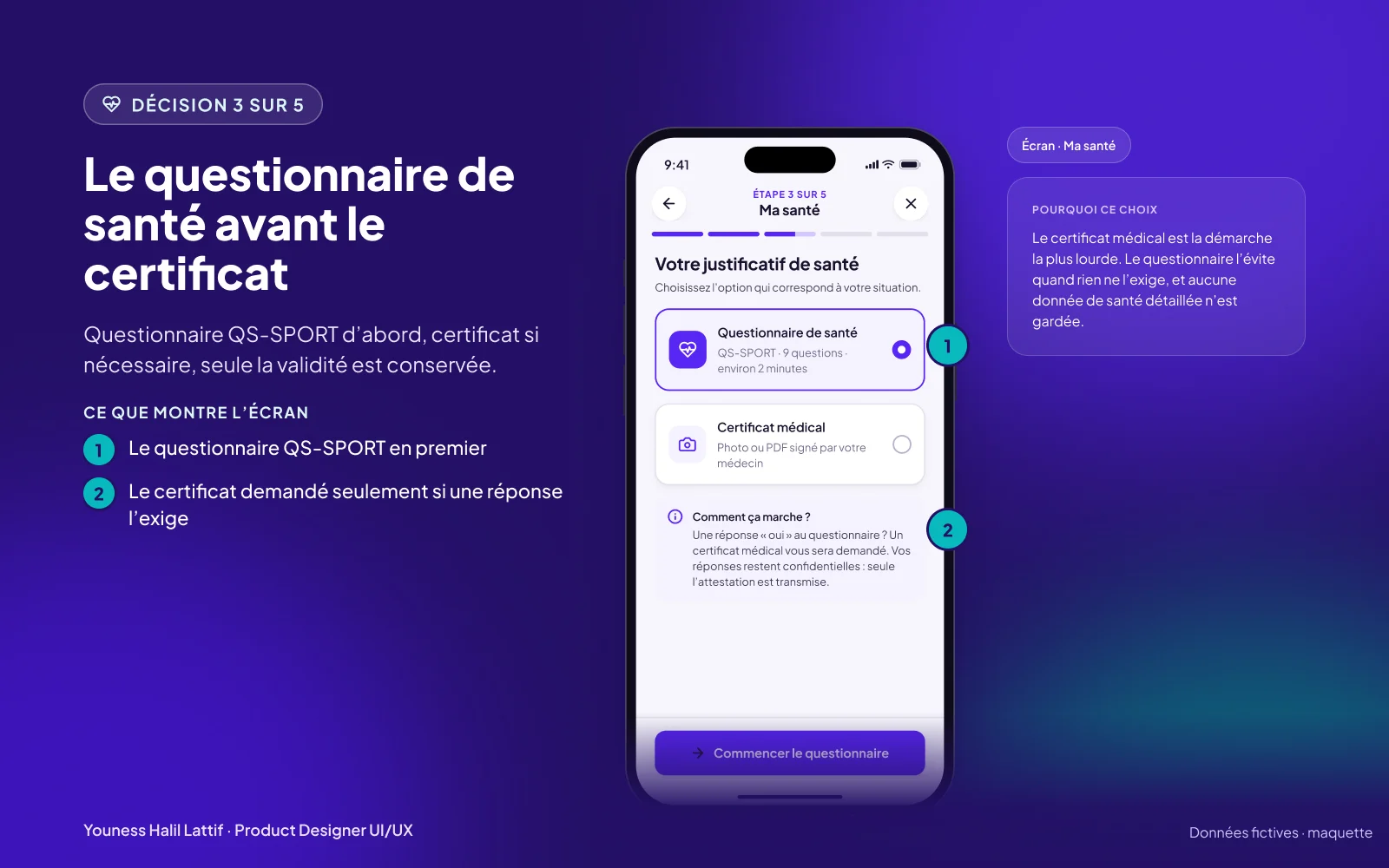
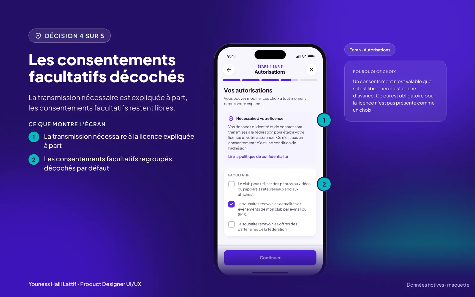
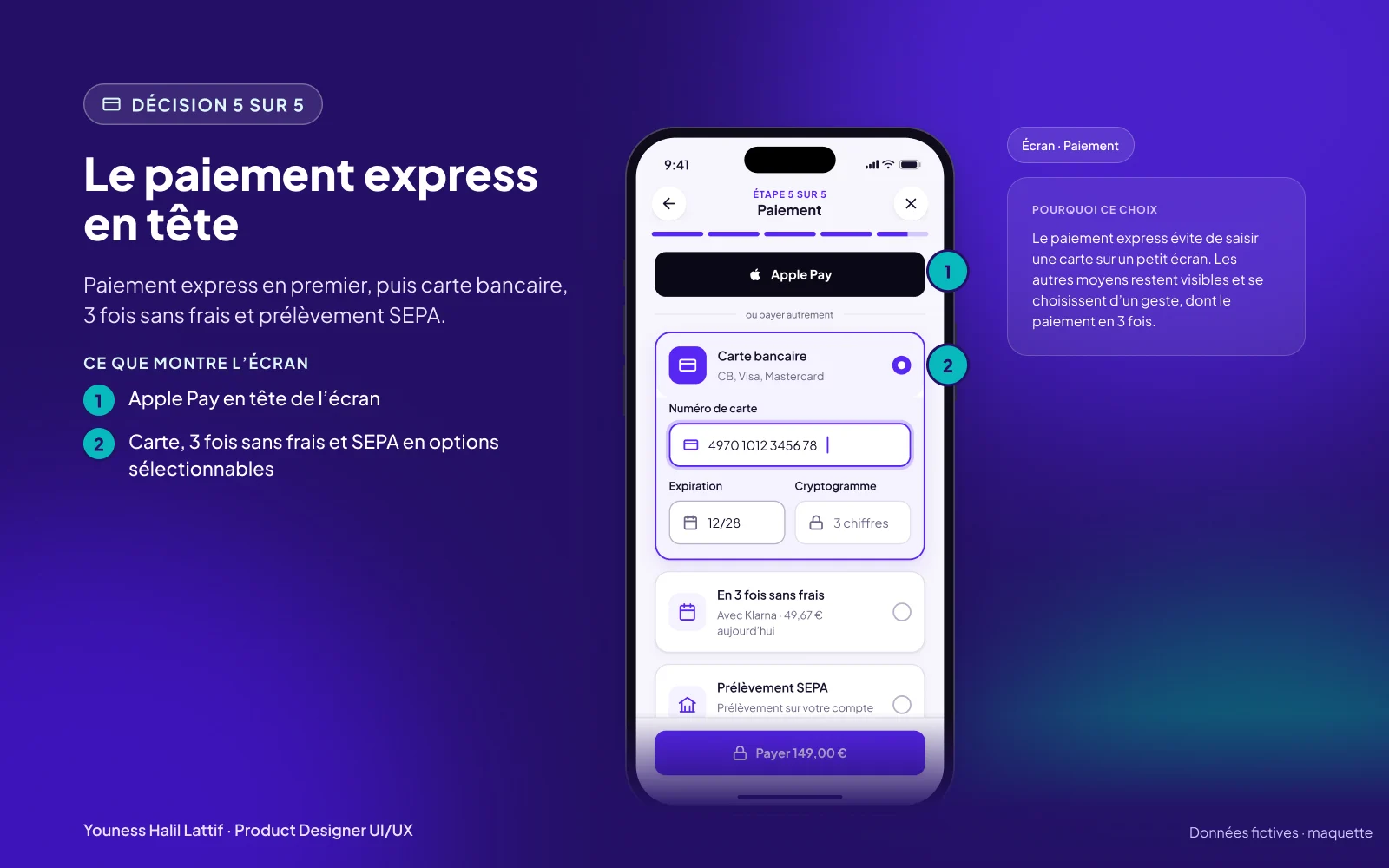
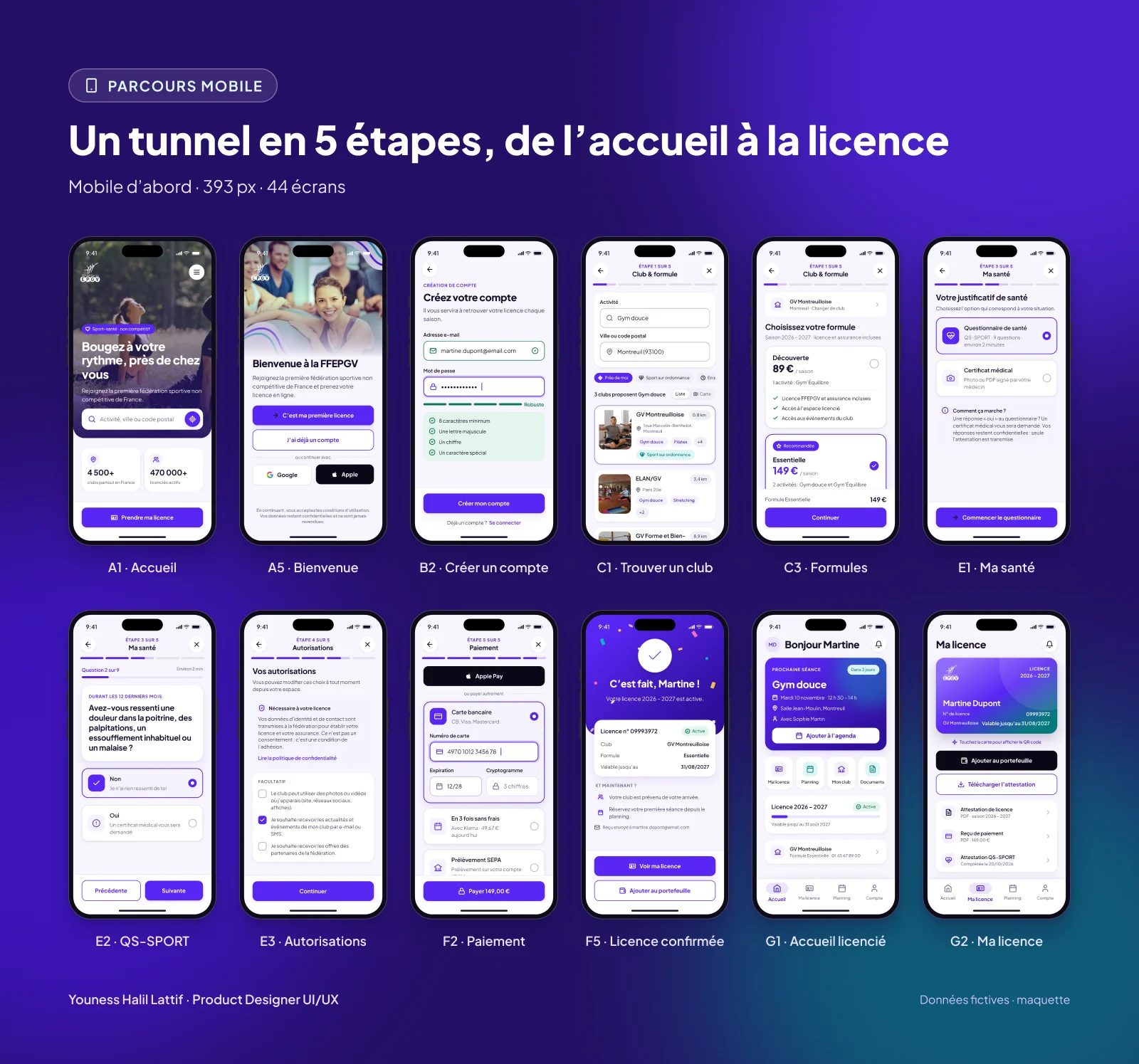
A flow in 5 clear steps: Club and plan, My file, My health, Permissions, Payment. Each screen carries one specific choice.
06 An accessible design system
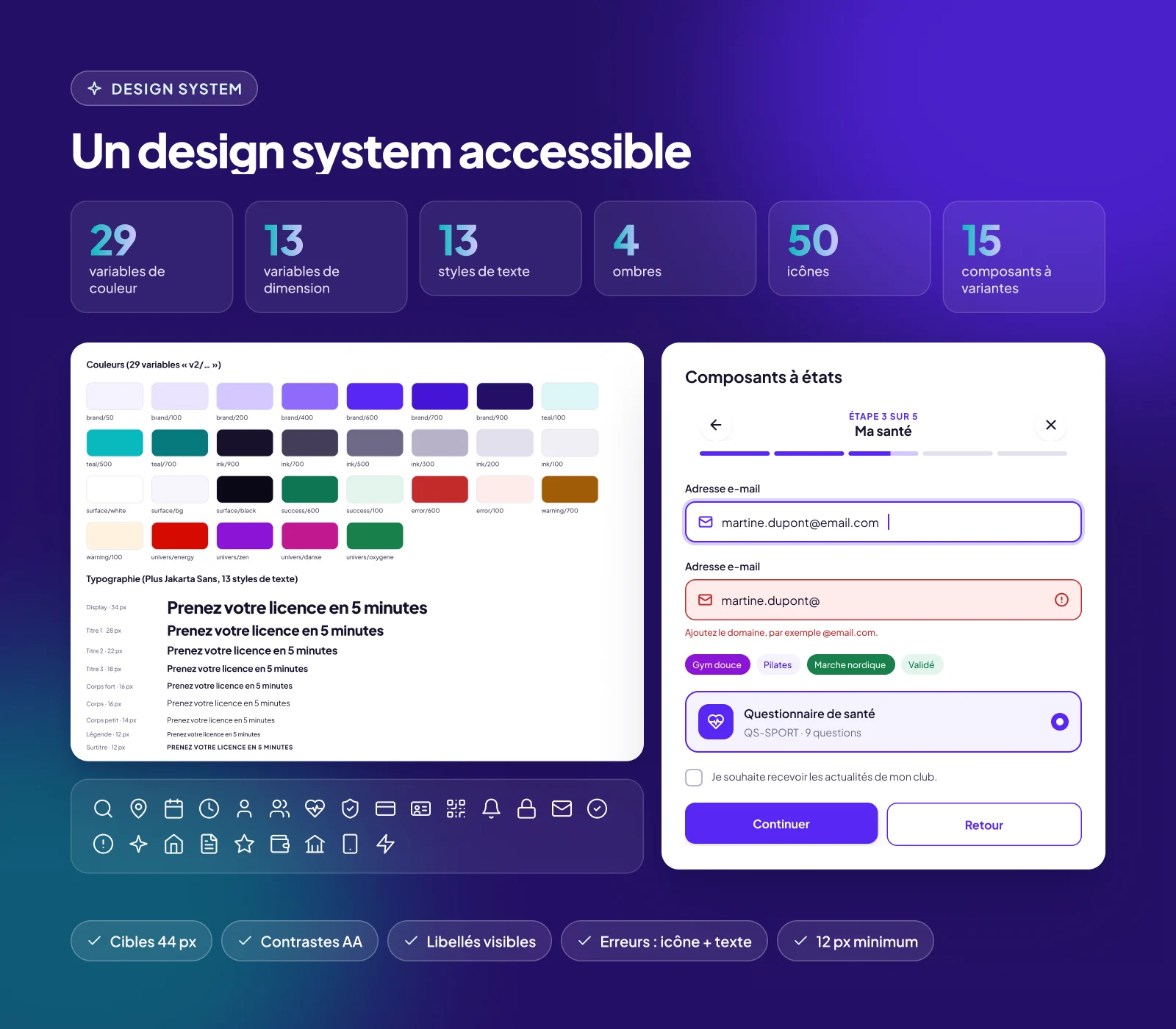
29 colour variables, 13 dimension variables, 13 text styles, 50 icons and 15 components with variants, in Plus Jakarta Sans.
AA contrast, 44 px touch targets, visible labels, errors flagged with an icon and text, never any text under 12 px.
07 Everywhere, on every screen
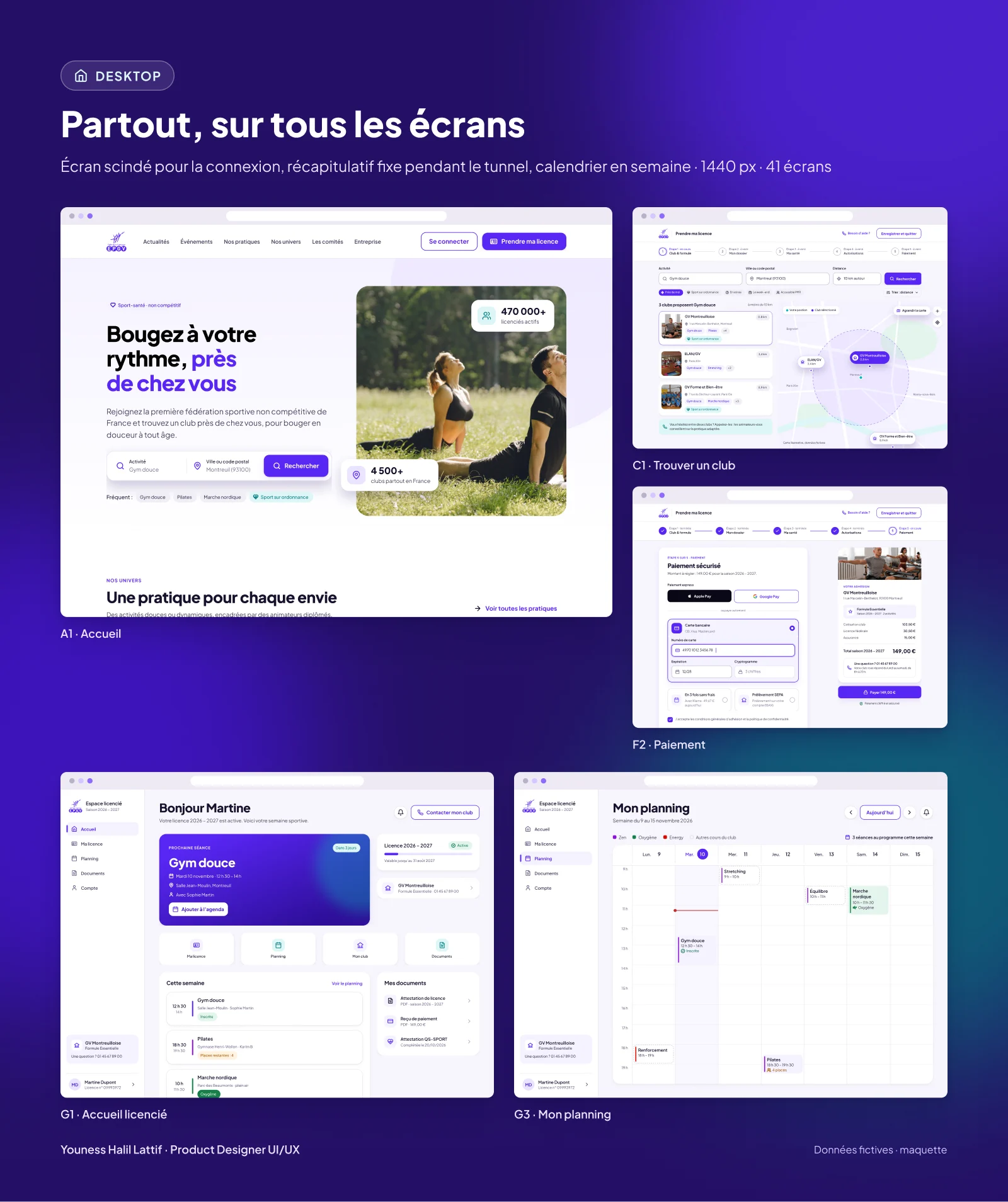
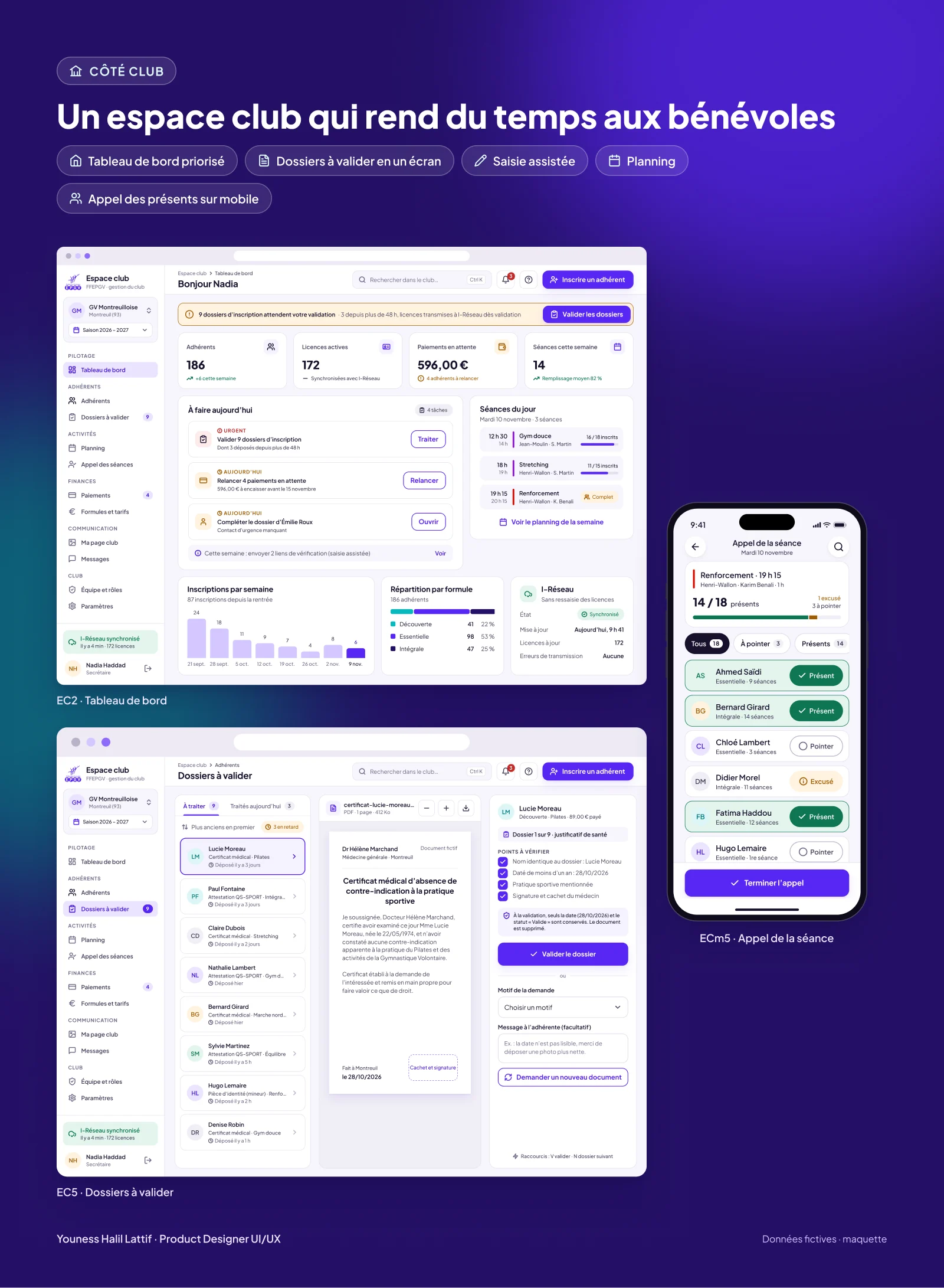
Mobile first, then tablet and desktop: split screen for sign-in, sticky summary during the flow, weekly schedule.
For clubs: a prioritised dashboard, files to approve on a single screen, assisted data entry, mobile attendance check.
08 Deliverables
Research, mappings, design system, mobile, tablet and desktop mockups, responsive club space and an animated prototype (Smart Animate, a flipping membership card, animated confirmation).
Figures counted by script in the Figma file.
09 Measuring success
Moderated test of the mobile prototype with 8 members, after V2 of the key screens. The promise holds: a median time of 4 min 20. The highest drop-off, 13%, is at the My health step.
Illustrative results, final-year project.
10 Transparency
- FrameworkFinal-year project, Master’s in UX design (ISCOD), 2026. Mockups not deployed.
- ResearchInterviews with a panel of 50 members and 20 clubs.
- User testModerated test of the mobile prototype with 8 members. Results shown for illustration.
- DataPeople, club and amounts in the mockups are fictional. Screens are in French.
- MethodDesigned in Figma with an AI-assisted workflow (Claude connected to Figma), directed and reviewed by the designer.