Concept project2026Design systemUI branding
How do three banking brands share one design system?
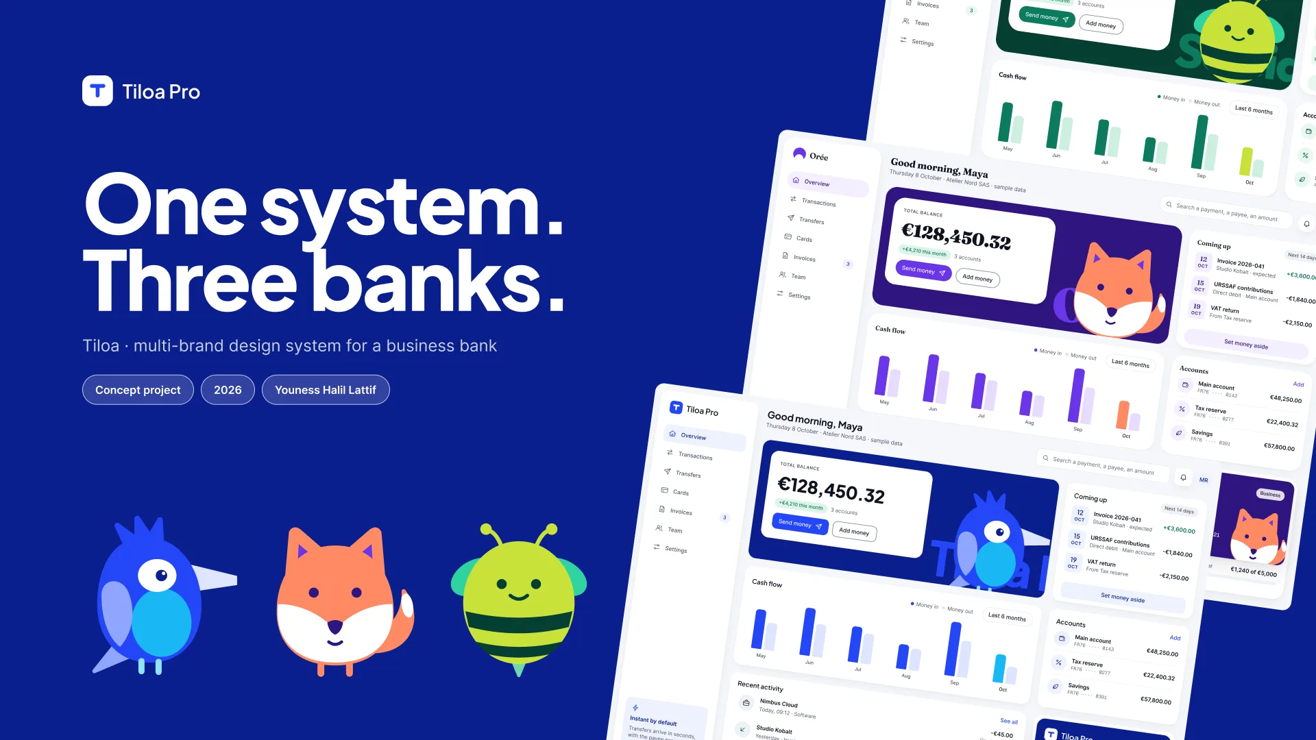
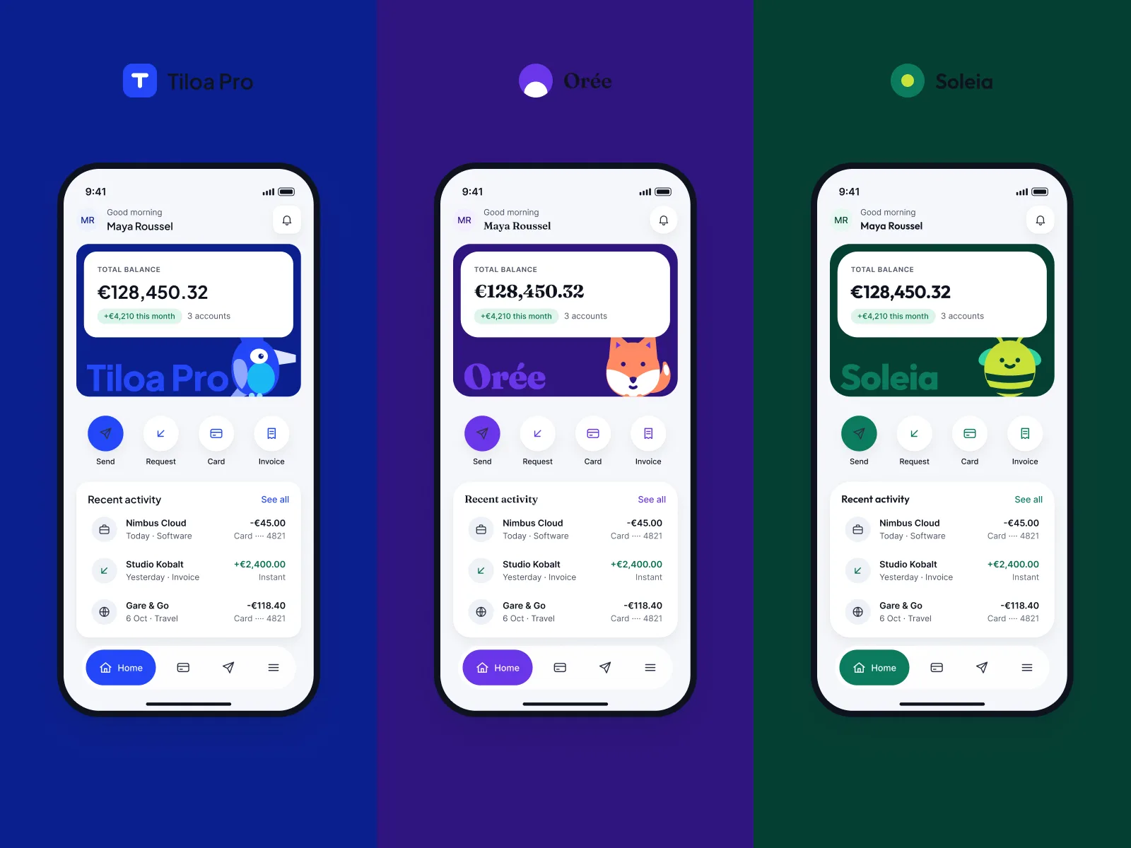
One design system, three fictional business banks: the brand becomes a variable mode and no component is redrawn.
Summary
- The problem. A fictional group launches three business banks. Each brand wants its own identity, without tripling the cost of maintaining the interfaces.
- The key decision. The brand is a mode in a Figma variable collection. Colours, radii, typefaces and the name change, the components stay single.
- The state of the outcome. Not measured. A Figma file with 124 variables and 29 components, 16 screens across the three brands, a 4-flow prototype.
Context and users
Tiloa is a concept project. It imagines a fictional banking group that runs three business banking brands on a single technical base.
Tiloa Pro targets SMEs and finance teams. Orée targets freelancers and sole traders. Soleia completes the range with a third identity.
The three brands sell the same services: account, cards, transfers, transaction tracking. Only the presentation changes.
Users are described as hypotheses, with no interviews. An SME manager checks the balance and approves transfers. A freelancer manages her card and sends a payment from her phone.
The figures in the context come from public sources. Urssaf counted 3.031 million sole-trader accounts at the end of December 2025, in its press release of 24 July 2026. A dedicated bank account becomes compulsory above 10,000 euros of turnover for 2 consecutive years.
The design question: how do you give three faces to a single product?
Constraints
- Business. Payee verification before an instant transfer has been mandatory since 9 October 2025. The interface must show the result of that check clearly before sending.
- Technical. One set of components. The number of modes per variable collection depends on the Figma plan, which bounds the architecture.
- Accessibility. The European Accessibility Act has applied to consumer banking services since 28 June 2025. Every text and background pair must hold its contrast in all three brands, not only the first.
- Time. Personal project run in October 2026, alongside other work. The scope was deliberately limited to 16 screens.
Research
Desk research, notes dated 4 October 2026. No interviews, no survey. I read the regulatory texts, the Figma documentation and the community token format.
I also browsed the public pages of Qonto, Shine, Memo Bank and Revolut Business as a visitor. The aim was to understand the sector’s vocabulary and tone, without comparing features.
The names Tiloa, Orée and Soleia were checked on 4 October 2026. No conflict was found in the financial sector.
- Regulation (EU) 2024/886 on instant payments, payee verification mandatory since 9 October 2025, ECB page.
- Directive (EU) 2019/882, European Accessibility Act, applicable since 28 June 2025 to consumer banking services.
- Design Tokens Community Group, “Design Tokens Format Module 2025.10”, 28 October 2025. A community group report, not a W3C standard.
- Figma help, number of modes per variable collection by plan.
- Urssaf, press release of 24 July 2026: 3.031 million sole-trader accounts at the end of December 2025.
- entreprendre.service-public.gouv.fr, dedicated bank account above 10,000 euros of turnover for 2 consecutive years.
- Public pages of Qonto, Shine, Memo Bank and Revolut Business, read as a visitor, no feature comparison.
Options explored
- Option 1: three separate libraries. One Figma library per brand, each with its own components. Easy to understand, each team is autonomous. Rejected: triple maintenance. Every button fix is done three times.
- Option 2: a theme by duplicating components. A shared library, then recoloured copies per brand. Rejected: drift between brands. The copies live their own lives and gaps settle in unseen.
- Option 3: 3D objects as a shared identity. First visual direction, with 3D objects shared by the three brands. Rejected: less distinctive than one mascot per brand, and heavier to produce. Dropped on 5 October 2026.
The chosen path is none of the three: the brand becomes a variable mode, detailed below.
Key decisions
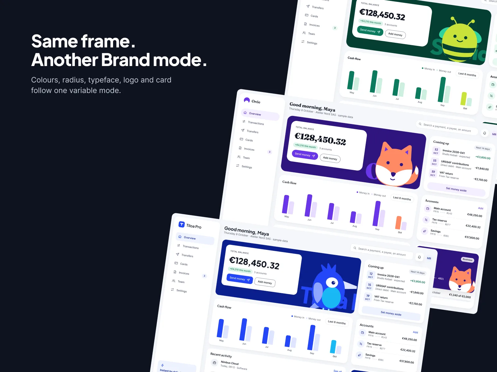
1. The brand is a variable mode
The screen. Overview, Transactions, New transfer and Cards on desktop, then Home, Card, Send money and Sent on mobile. Overview and Home also exist in Orée and Soleia.
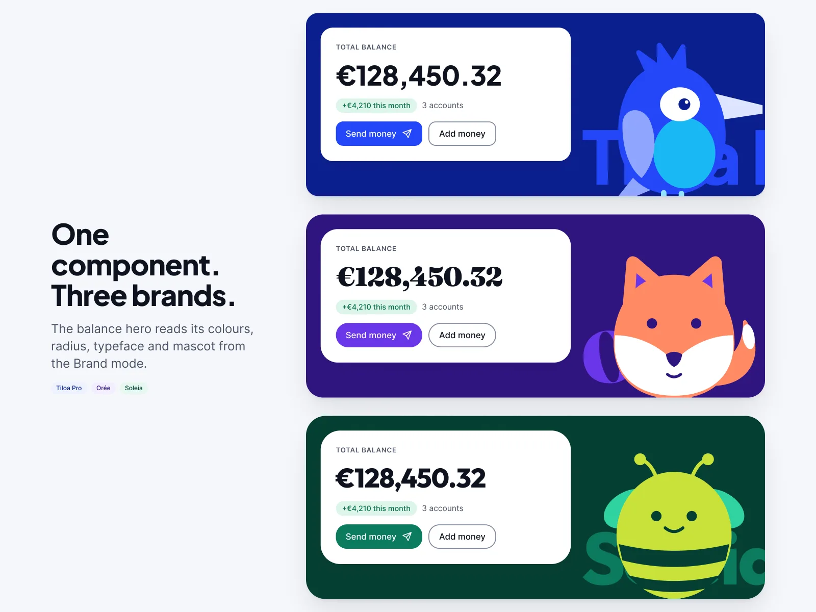
The rule. The Brand collection has 3 modes. Each mode sets the colours, the radii, the typefaces and even the displayed brand name. Plus Jakarta Sans for Tiloa Pro, Fraunces for Orée, Outfit for Soleia. The 6 collections total 124 colour, number, string and boolean variables.
The trade-off. Everything that differs between brands must go through a variable. A brand cannot have a component of its own. That constraint is accepted to guarantee a single line of maintenance.
2. Payee verification in three states
The screen. New transfer on desktop, Send money on mobile. The verification result appears before the confirmation button.
The rule. Three states, always text plus icon: Match, Close match, No match. Colour alone never carries the information. The primary button label reaches 6.3:1, 6.4:1 and 5.3:1 depending on the brand. Error text reaches 4.6:1.
The trade-off. Only three states. Anything that is neither Match nor No match falls under Close match, with explanatory text. It is easier to read, but less fine-grained than the real range of cases.
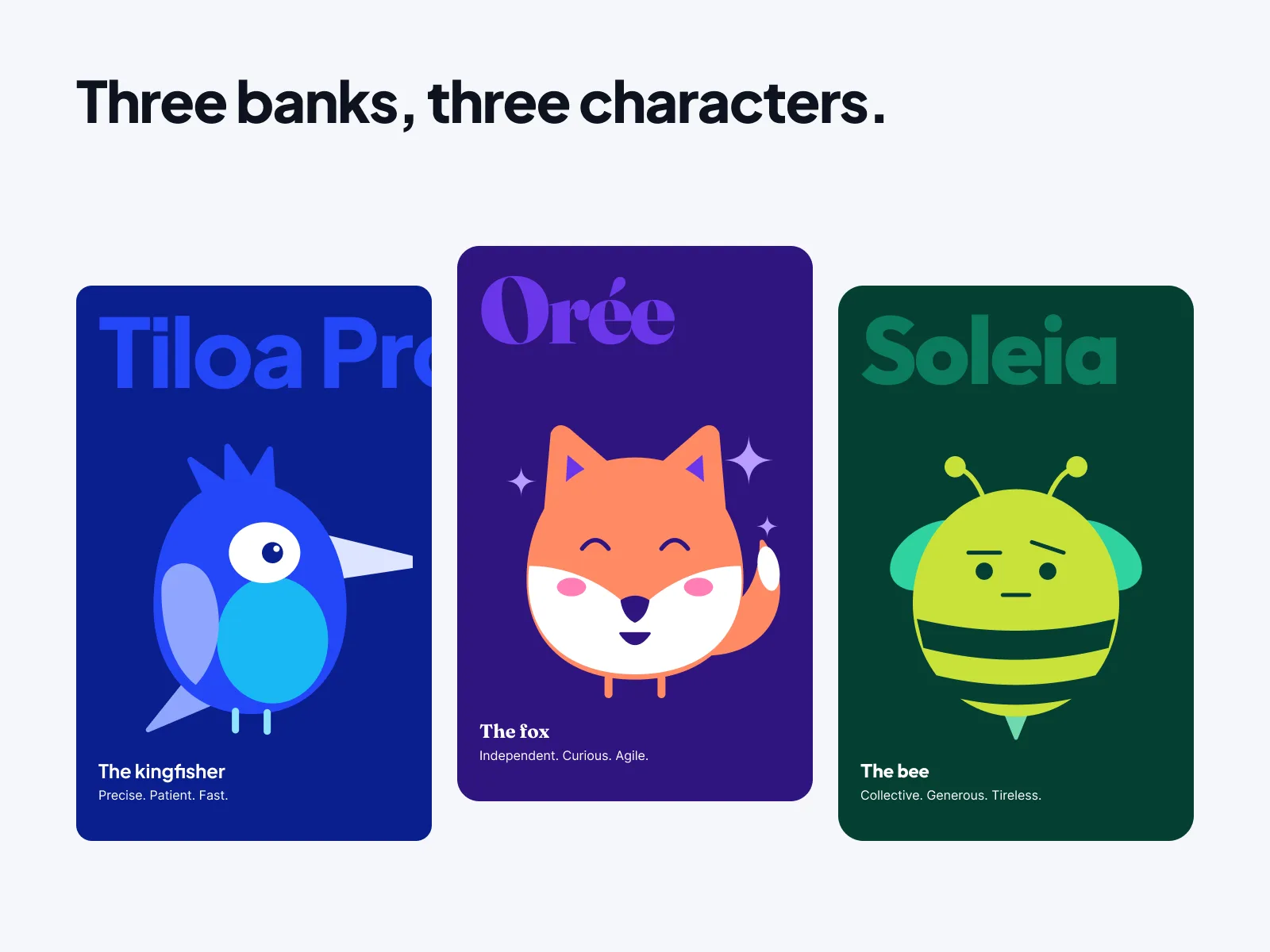
3. One mascot per brand, away from the data
The screen. Home on mobile and Sent after a transfer. The mascot accompanies the welcome and the confirmation, never a list of transactions.
The rule. The mascot is the only expressive element of each brand. It stays flat, in the “bright fintech” direction. It never appears in an area of figures or input.
The trade-off. Three characters to draw and maintain instead of one shared object. The gain: one character per brand is more legible and more distinctive.
Outcome
Not measured. Metric: the time needed to apply a component fix to all three brands. Reading: time the same fix in Tiloa and in three separate libraries, over a series of typical fixes.
Figures counted by script in the Figma file, mascot version.
What I learned
A multi-brand design system is won in the variable architecture, not in the components. If the brand name is a string variable, the rest follows.
Contrast has to be checked three times, once per brand. An accent colour that passes in Tiloa Pro can fail in Soleia. The calculation script checks every pair in all three brands.
Changing visual direction midway has a cost. The 3D objects were attractive as still images, but they did not tell the story of three brands. The mascots do.
Designed in Figma with an AI-augmented workflow: Claude connected to Figma through MCP, directed and reviewed by the designer.
Transparency
- ClientNone. Personal project, sample data, fictional brands.
- ResearchDesk research on dated public sources. No interviews.
- User testingTest plan written, not run.
- AccessibilityContrasts calculated pair by pair for the three brands. No audit, no conformance statement.
What AI did, what I decided
The AI
- Generated the per-brand screen variants from the variables.
- Wrote the scripts that count variables, components and screens.
- Wrote the contrast calculation script for the three brands.
Me
- Designed the architecture of the 6 collections and the 3-mode Brand collection.
- Chose the three states of payee verification.
- Drew and placed the mascots, outside the data areas.
- Reviewed every screen in every brand.
 Next projectBelriveAccessible online public services portal